Scroll
VAULT Academy
The VANROOY design team reached out to us to rebrand their interactive and board-gaming venture, HUNT Academy.
Services: Design
The Challenge
HUNT Academy, as it was known at the time, had already been doing business for years before they reached out to us. Following several successful years in the interactive/family games market, they decided it was time to update their visual identity and make it more relevant for the audience they were trying to reach.
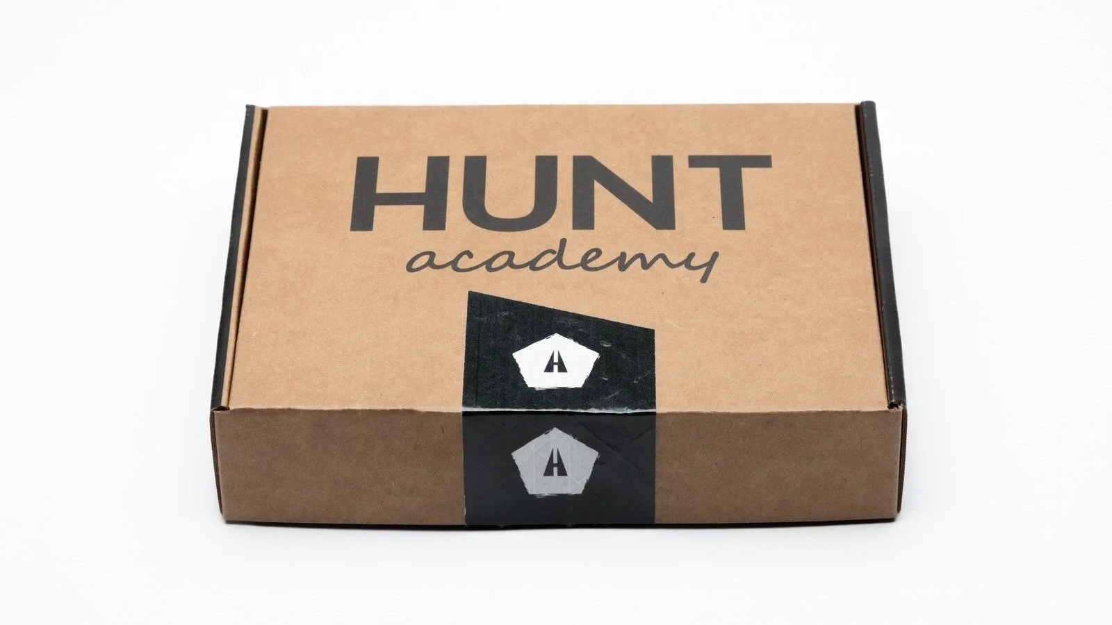
HUNT Academy’s previous logo and packaging.
At the time, HUNT’s visuals geared themselves toward children ages 6 and older. With the revamped look and feel, they hoped to introduce a more balanced, neutral aesthetic geared to both children and their parents, given that their games are activities for the whole family to enjoy. HUNT approached us with most of their new strategy already intact, and were ready for the design process.
The Process
We learned that parents, in particular those between the ages of 35 and 44, were actively engaging with the HUNT brand. This included many calls-to-action including making purchases, signing up for newsletters, and so forth. The goal behind our original concepts for HUNT was to appeal to kids and their parents, maintain Hunt's Brand Heart, and highlight the interactive nature of their products.
However, a few weeks into the Create phase, HUNT changed their name to VAULT.
They made this decision because they felt VAULT would be more approachable to the entire family, and would give the brand a nostalgic tone. VAULT also wanted to give their aesthetic a “Southern California” feel, similar to the skate and surf brands they (and many of the other parents of their target audience) grew up with.
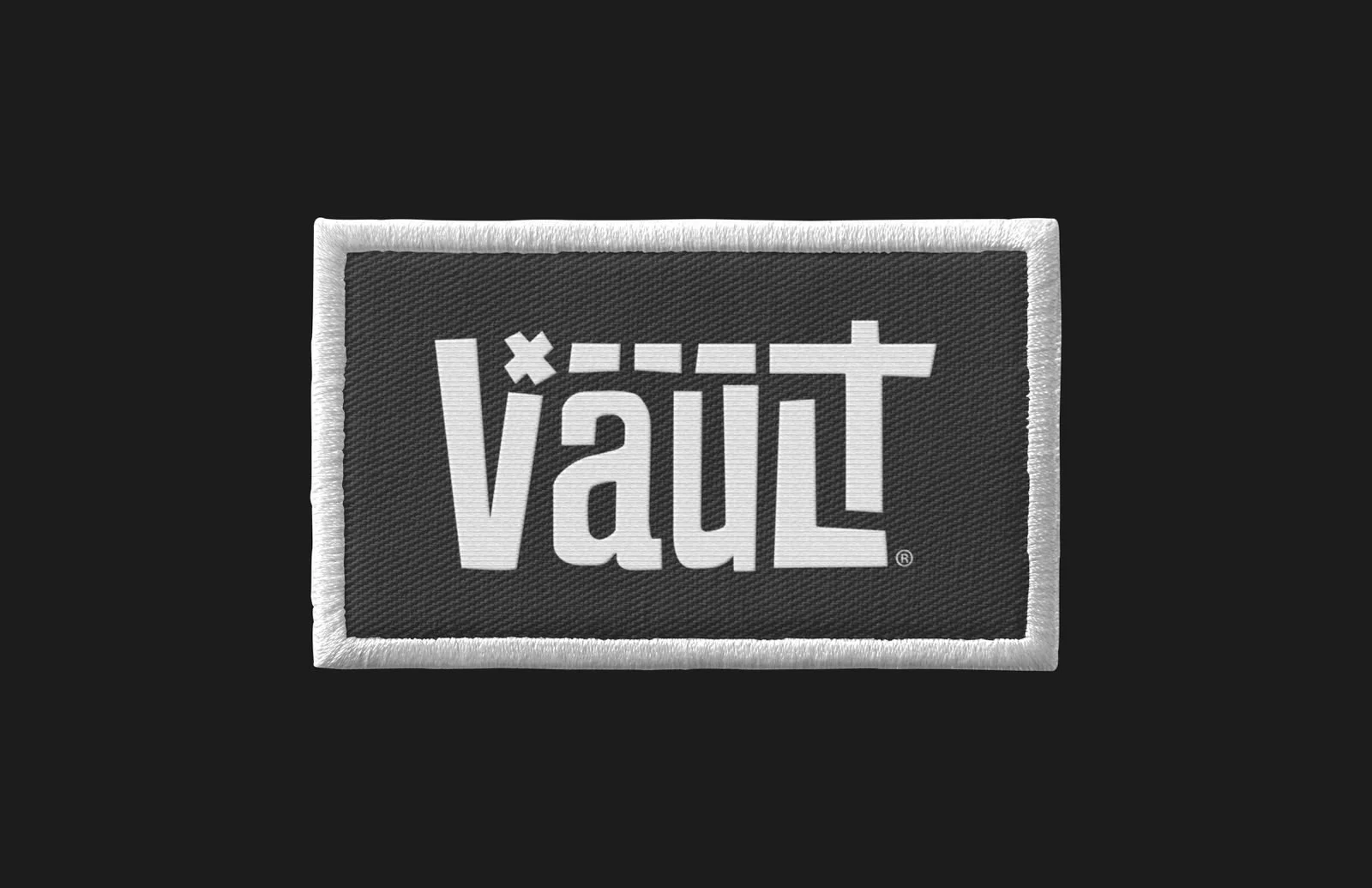
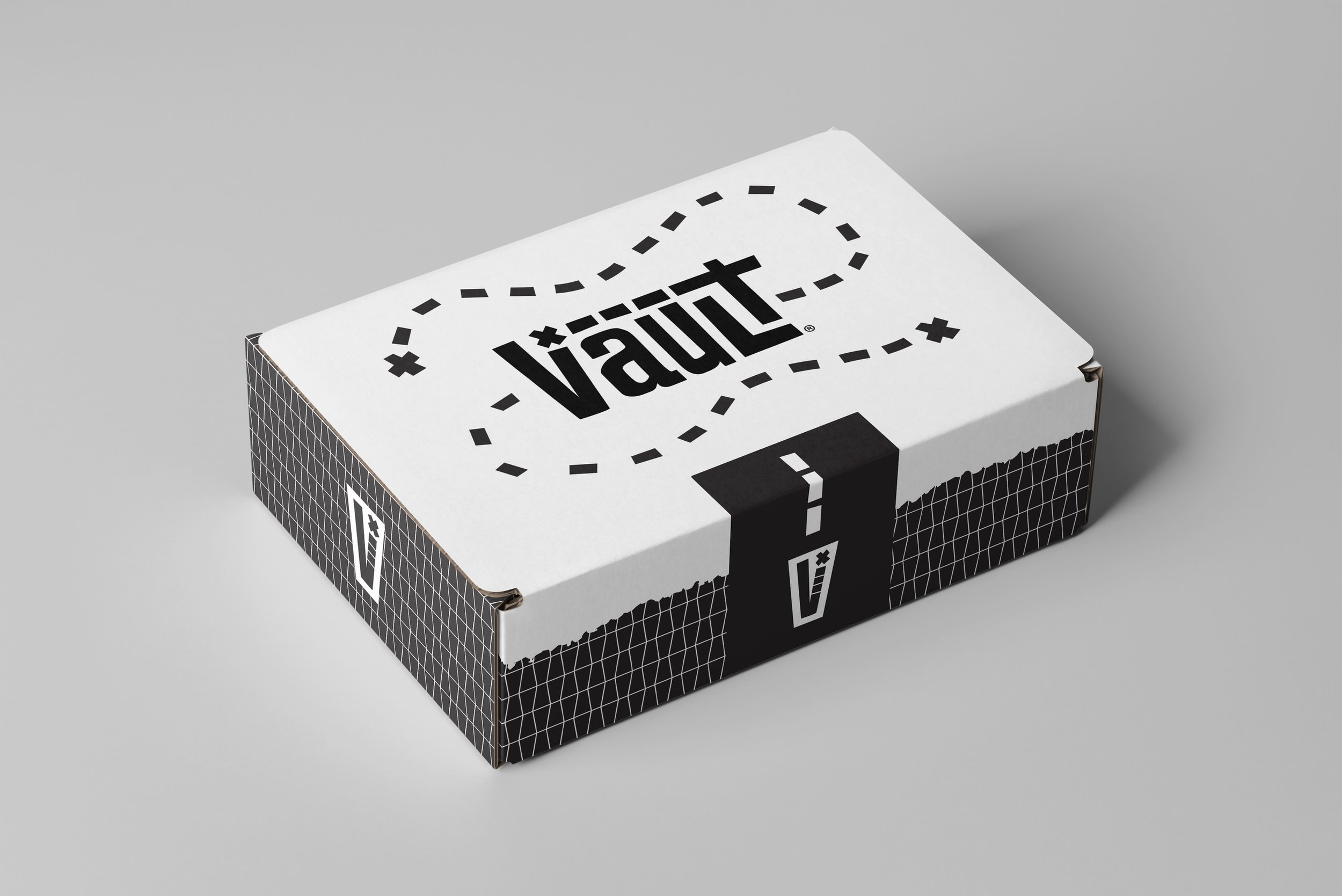
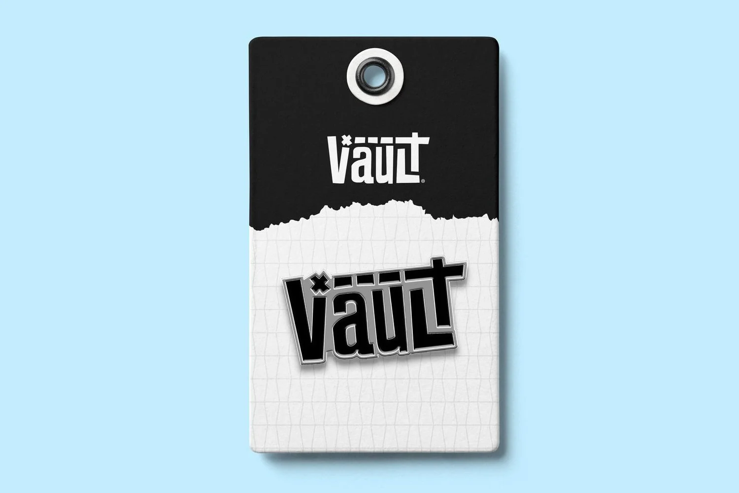
To reflect the active, thought-provoking nature of their games and products, we created a custom typeface that resembles a maze. Several graphic elements incorporated into the logo mark represent a treasure hunt, tapping into the excitement, rewards, and satisfaction a family would gain from playing the games.
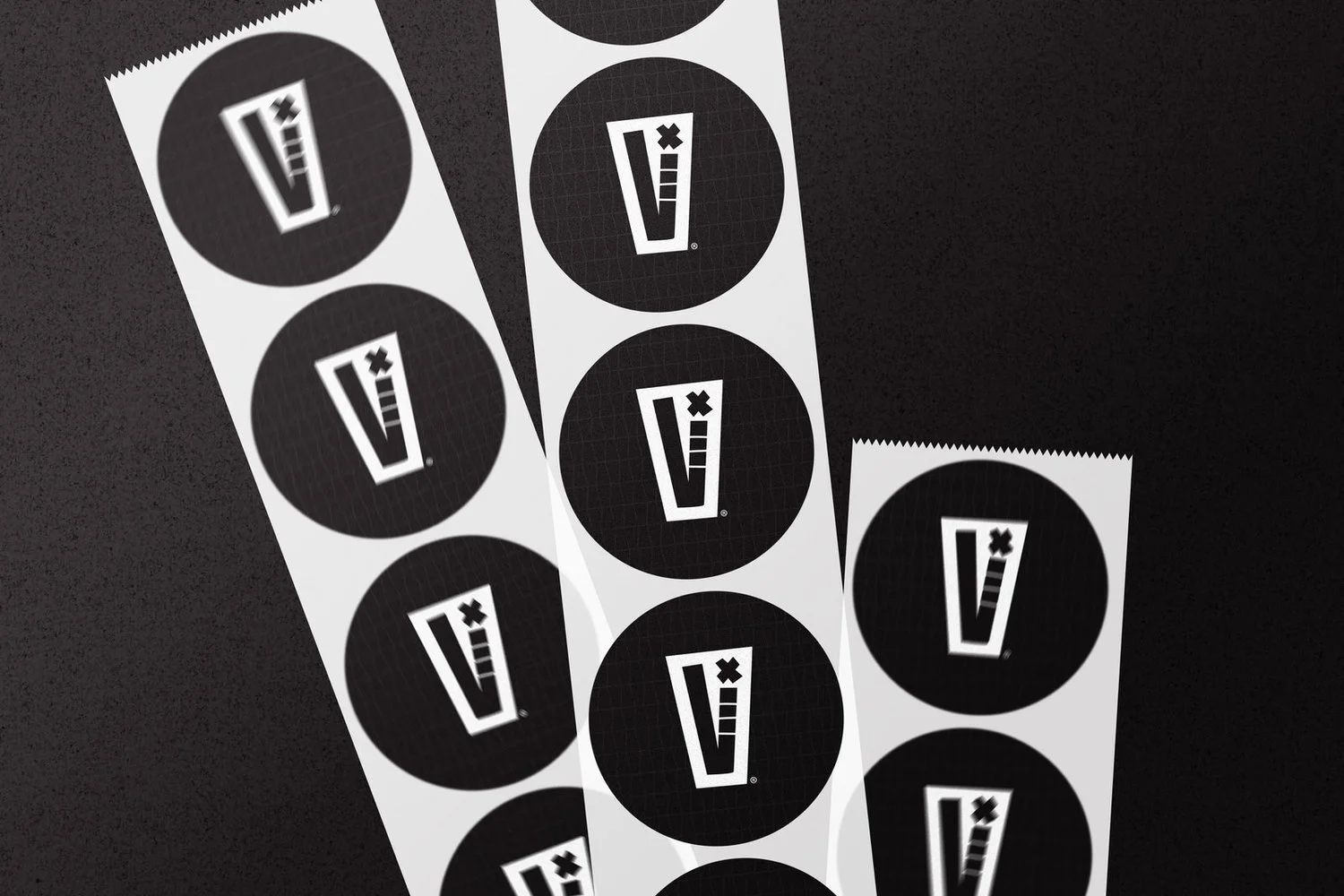
HUNT's original branding lacked an expansive color palette that could be used on all touchpoints cohesively. To provide VAULT with plenty of cohesive options for future products and games, we created a comprehensive ROYGBIV color palette with various hues, tints, and shades to choose from and still be on-brand.

The Results
Following the approval of the revised logo mark, we began to work on other identity and brand touchpoints, including packaging and print design.
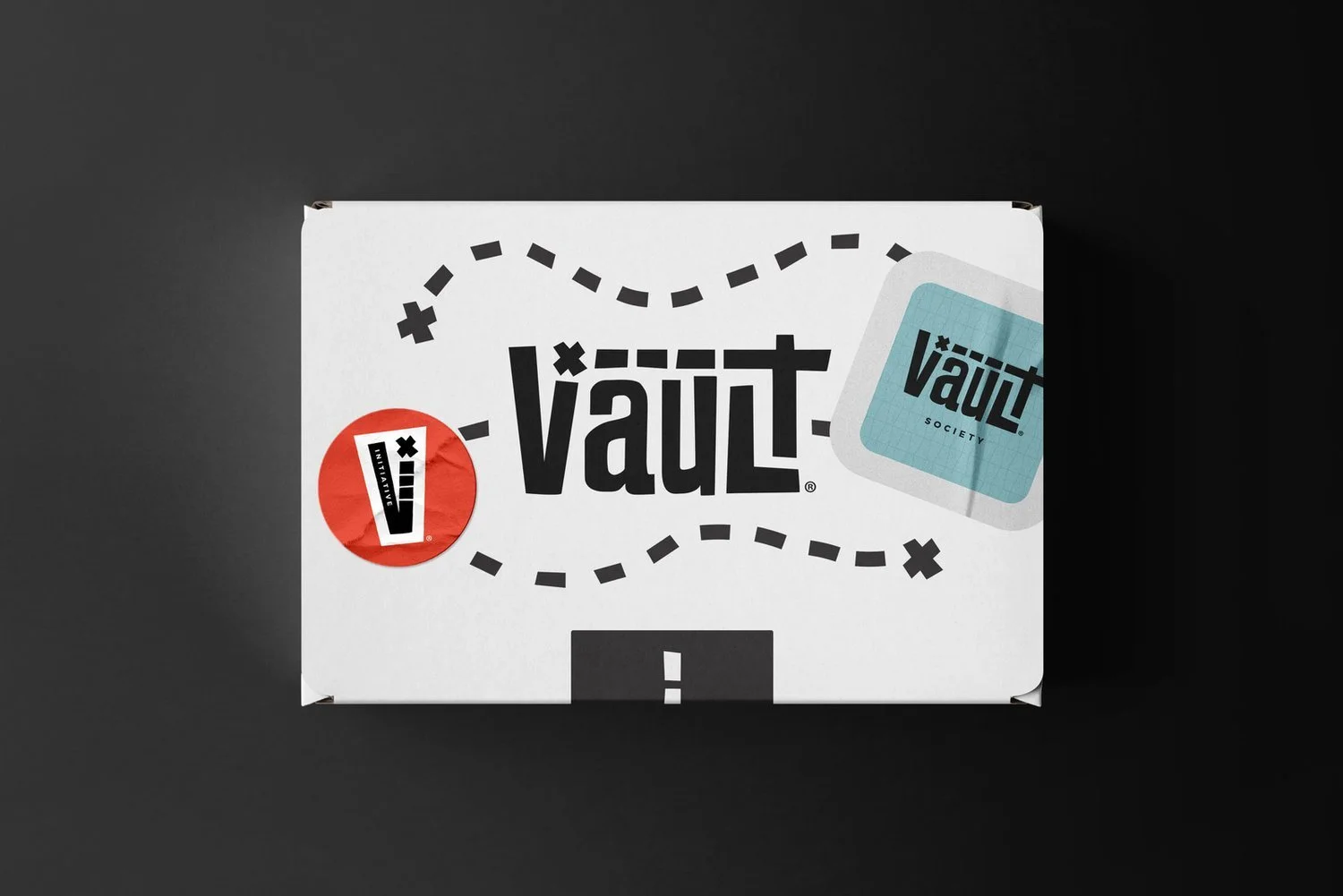
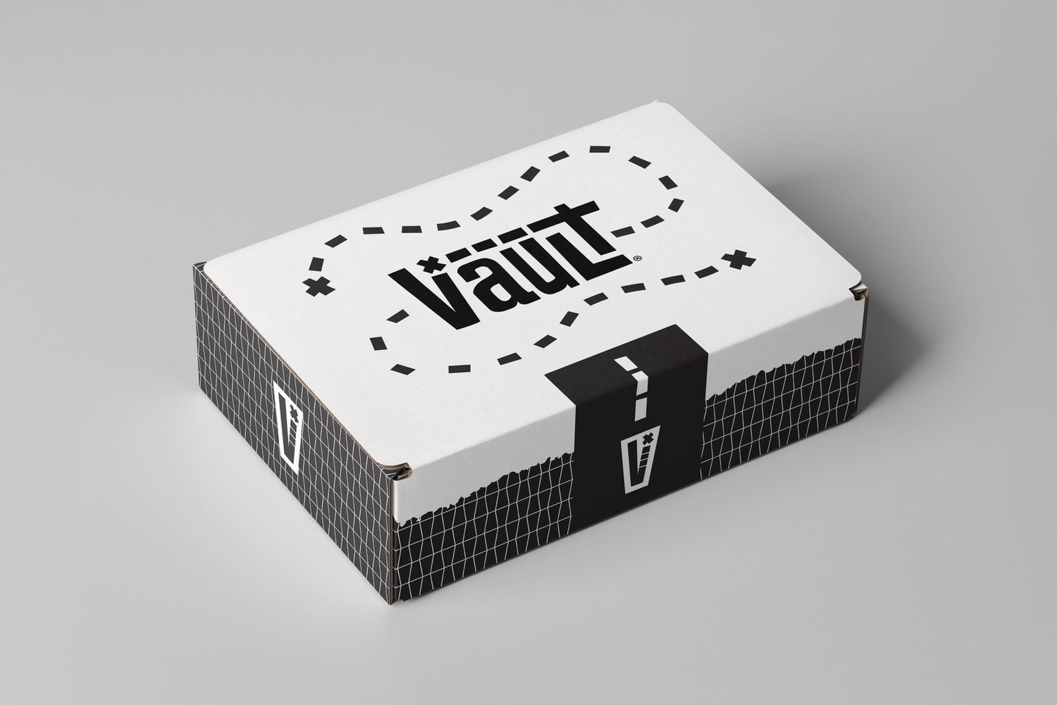
Complete list of services: Logo, Illustration, Identity (Color, Typography, Elements), Imagery, Collateral (Packaging, Stationery, Apparel, Print)