
Scroll
Stanford
University BLSA
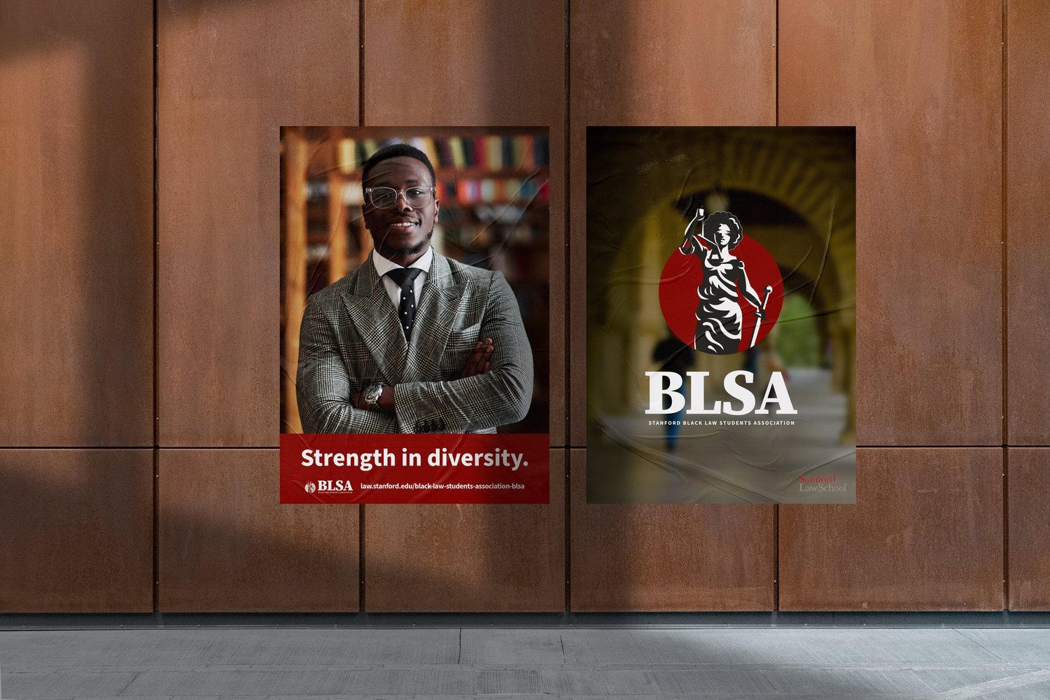
Stanford University’s Black Law Student Association (BLSA) reached out to Hueman Studio for a modern-day logo refresh.
Services: Strategy, Design
The Challenge
Stanford University has one of the most universally recognized Black Law Student Associations in the nation. Given America’s current focus on diversity, inclusion, and union, Stanford BLSA wanted a logo refresh they felt represented the new and future generations of African American law students attending their school. Their old logo, despite representing black culture, felt like a very dated and unpolished design given Stanford’s prestige.

Stanford BLSA’s old logo design.
The Process
During the onboarding and Identify phase, we targeted Stanford BLSA's target audience of students as a healthy mix of Generation Z and Millennials, with a slight advantage of females over males. BLSA’s board member demographic also fell into these categories, but with a much heavier edge of females over males. Equipped with these facts and other similar factors, the design process began.
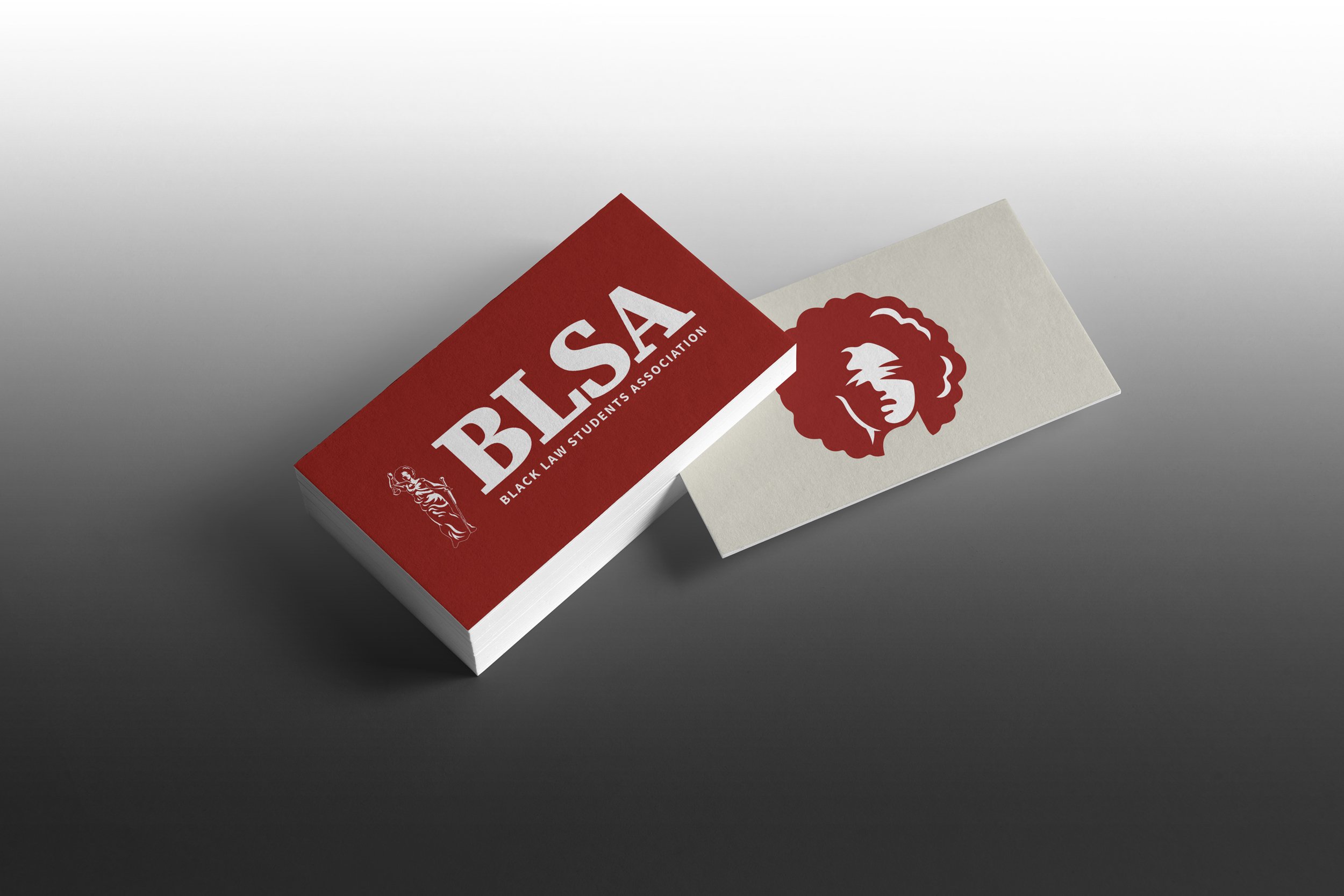
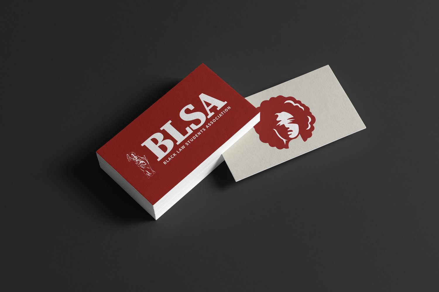
One of the first ideas that came to mind was to give Lady Justice, already a symbol in the justice & law world, a sister. Known as “Black Lady Justice”, this sister is an African-American presentation of the popular symbol, covering law, justice, and black culture in one logo mark.
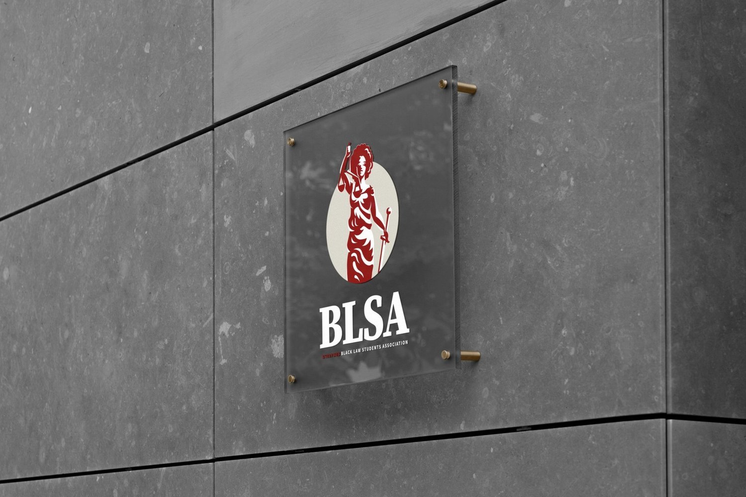
The new logo mark for Stanford BLSA.
To enhance its alignment with Stanford's identity as a whole, we also applied Stanford's current font and color palette to the logo design.
A mini-mark of Black Lady Justice's head stands as its own icon mark to fit in smaller areas whenever needed.

The Results
Complete list of services: Audit, Research (Consumers, Archetypes), Insight & Planning, Logo, Illustration, Advertisements, Collateral (Packaging, Stationery, Apparel, Print)