
How to Create Actionable and Quality Website Copy and Content Using AI
You are a small team and want some work done to your website, but you don’t have the time or expertise to create a full action plan. Leaning on AI as the team member with branding and web design expertise is efficient but can lead to additional work created down the line if not navigated with strategy — especially if you are working with a designer.
Overall, it is best to start with some open communication with your designers around how they work best with AI generated instructions/content and if they have any existing recommendations based on their knowledge and expertise. By working with your designer, you can set expectations and ensure that any content shared will result in a desired final product. From our experiences, here is the best way to lean on AI for your website needs.
Using AI for a Website Audit
Let’s say you have an existing website, but you want some changes. You know things don’t feel right, or they could be improved. Maybe some pages were quickly thrown together, or maybe you are realizing the current design isn’t productive.
To start your website audit, open up your AI of choice. We have been using Claude (Sonnet 4.6) a lot lately and will be using it for all of the examples below. Since this is a pretty high level task, here is a sample prompt you can use to get things started:
“[Organization Name] is a [organization type]. Our mission is [mission] and our brand guidelines are attached [attach brand guidelines]. Can you audit the website for any improvements or suggestions? [website url]. ”
“HomeAid is a nonprofit organization. Our mission is to build a future without homelessness and our brand guidelines are attached. Can you audit the website for any improvements or suggestions? homeaid.org”
Maybe your AI already has a good understanding of your brand, so it might not be necessary to do all of the introduction scaffolding. It is a good idea to include the brand guidelines incase the AI tries to suggest something that may be a good idea for a different organization, but for yours it is against the guidelines. If you are sharing the audit with a designer, it is also helpful to have as actionable and truth-based directions as you can.
Once Claude gives a response, it is important that you go through the suggestions. Don’t just copy and paste and forward them to your web designer! Whenever you are working with AI, human discernment and decisions are always important to ensure outputs are high quality and actually helpful. Claude will typically group the suggestions in terms of high to low priority. Here is what the audit stated.
High Priority
Data & Content Inconsistencies: Claude caught some text inconsistencies, which is super helpful when you have a website that is consistently changing and has over 10 pages. These text inconsistencies included important annual statistics and organizational information that were quick and easy fixes.
Medium Priority
Brand Voice Inconsistencies: Due to some inconsistencies in phrasings across the website, Claude pointed out the lack of direction in the brand guidelines on how to proceed with this phrasing. This is helpful because it highlights a potential gap in unified brand language. However, for the example it gave, it wasn’t applicable to the organization.
Visual & Design Observations: Claude advised ensuring images hosted on the website had proper naming conventions and fit correct spacing standards. If your site was designed by a professional or with professional assets, this is a concern that can be overlooked. However, it might be a good reminder to double check that the images used are scalable for multiple screen sizes.
Low Priority
Accessibility: Claude alerted us of some missing alt-text on certain images, and advised us to do a more thorough accessibility audit using a dedicated accessibility tool like Wave. Since we are already conducting accessibility checks for our maintenance clients, this is another tip we took with gratitude but ultimately ignored.
Structural / UX Suggestions: These suggestions were mostly related to content that didn’t necessarily need to or could be updated. For example, Claude pointed out that all of the events on the website seemed to favor one location. That’s just the reality and not detrimental to the average user experience. Another common suggestion was to not link the donation page to an external page. This set up is a request from the client, but also a more streamlined way of getting donations. Having donors pay directly through an external fundraising platform actually increases confidence and streamlines donations, as they don’t have to wait for third party embeds to load or doubt the legitimacy of the donation form. Some final suggestions went against Squarespace’s built-in structures.
Using AI to Write Your Website
Maybe you have some brand verbiage down but need help filling the gaps. AI is a great way to take what you have and build upon it.
Here is a sample prompt to get started:
“My organization [insert name] is a [insert organization summary]. We are currently refreshing our website. Attached are the brand guidelines [attach brand guidelines]. Can you write a sample website outline and give some design direction as well? ”
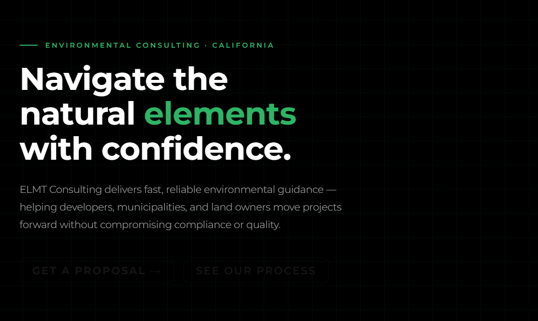
“My organization Envirogy Consulting is an environmental consulting firm. We are currently refreshing our website. Attached are the brand guidelines. Can you write a sample website outline and give some design direction as well?”
Claude should output some visual mockups as well as some design notes. We received an interactable mockup with the website copy, as well as site structure, design direction, and key element notes.
The Copy
Claude created a great structure and hierarchy of text needed for basic website sections, like a homepage hero, about bio, and convertible microcopy.
However, some verbiage was created that didn’t really match the voice of the organization. For example, the homepage H1 “Navigate the natural elements with confidence”. The audience for this website would be those who need environmental consulting services, so vague and everyday language like this, especially the “natural elements” phrase, wouldn’t be applicable. We would choose to replace this H1 with the organization’s tagline “Clear. Responsive. Environmental Leadership”. The microcopy chosen for the main CTA was “Get a Proposal”, which also isn’t necessarily the truth. The client wants a wide range of prospects to be able to easily reach out to have a conversation and then follow up with a detailed proposal.
Another downside to the copy presented by Claude was the lack of substance. Each page only had 1 or 2 sections, which isn’t typical for a final website. This isn’t Claude’s fault, since we didn’t give it much to work with, but this is where the human direction is needed. Go through each page’s copy presented and see what is missing: statistics about your organization on the homepage, team qualifications and bios on the about page, case study write-ups, reviews, etc. We understand it is scary to start with a blank document, but AI produced work should always start as a framework to build upon.
👀notice the hidden buttons, uh oh
Site Structure and Design Direction
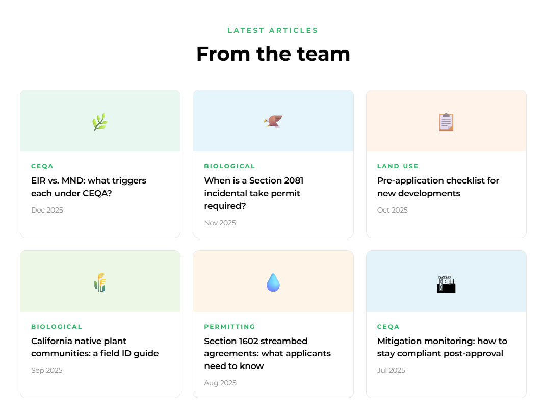
Claude did a great job coming up with a sitemap. It came up with 6 pages and explained what went on each. Even if you don’t use the copy Claude provides, sharing this sitemap and details on what will go on each page with your designer is super helpful. It gives us a clear vision of the story and content.
Home — hero, proof stats, services grid, process CTA strip, core values, blog preview, contact form
Services — full list of service offerings with brief descriptions
Our Process — the 4-step timeline
Insights — blog/thought leadership hub (supports the brand's "Expert" voice)
About — brand story, the symbol narrative, values
Contact — detailed intake form with the typical timeline displayed alongside it
For whatever sitemap is created, make sure the buttons on the website can lead to the intended pages.
If you are comfortable with basic information organization and sitemaps, check out Relume.io, a tool we use to help generate sitemaps.
For design direction, Claude did good showing the color palette in action and how to appropriately use it while adhering to accessibility practices. However, this was already laid out and established in the brand guide (approved color combinations).
The brand guide contained some visual directions that Claude largely overlooked. There is a branded pattern that Claude attempted to use, but it is so faint and not the exact pattern. Claude also didn’t use any imagery when there are specific brand imagery instructions. There might be some potential placeholder spots for images, but Claude doesn’t point that out. Overall, we’d let the design professionals handle this step of the process.
Emoji’s are not brand appropriate for this organization
What if I don’t have a super fleshed-out brand?
If you don’t have a well-defined brand, it is always encourageable to define the visual language and create guidelines before extending the brand to touchpoints like a website. However, if you really need to generate some directions and ideas using AI, you will need to pay extra attention to the content generated. Here is a sample prompt you can use:
“I need a full website redesign with design notes and copy guidelines created for my [insert business] called [business name] [url]”
“I need a full website redesign with design notes and copy guidelines created for my tax advisory business Eagle Accounting Advisory. eagleaccounting.co ”
Claude will spit back an incredibly thorough mockup, copy guidelines, and notes to share with the designer. Use this checklist to double-check the relevancy of the work provided before sharing with a designer.
Styles: Do you like the colors presented, is it a color palette that “works”, does the type match the business goals, etc. Consult with the designers before nailing anything down.
Layout principles: Claude will return very specific and technical parameters that may go over your head. Some of these things may be able to be designed for, while others may not be if you are working within an existing CMS. All CMS’s have their own code setup’s and site defaults that may be unable to be changed.
Copy guidelines: Read through the guidelines and see if these actually fit your organization. Maybe you have a “stuffy” service, like tax assistance, but your primary customers are family-owned businesses. Your audience would probably appreciate a different tone than maybe a Fortune 500 company.
Actual copy: Is everything accurate? If you used the prompt we used, chances are, no. Going based solely off of what an LLM knows about other tax advisory businesses won’t bring about accurate results for your organization. Our recommendation is to put all of the copy presented in a document, and edit it with what is accurate.
For example, Claude suggested “We are not a volume firm. We do not rush you through a checklist. Eagle Accounting Advisory works with a curated client base of entrepreneurs, high-net-worth individuals, and ambitious businesses who expect more — more insight, more access, more impact.”
The client base list is not accurate. Here is an edited version. “We are not a volume firm and don’t operate based on a checklist. Eagle Accounting Advisory works with small businesses, local non-profits, and growing businesses who want an easy and stress-free tax experience." This edit could also be written by AI if you ask.
In conclusion, keep in mind that AI is supposed to be a tool. It is best used to take you from phase 0 to phase 1. Once you have a framework, using your decision-making skills or discussing with a knowledgeable professional should help yield the best results for your organization.